🔒
NDA Protected

This case study is password protected

This project is covered under NDA. Please enter the password to view the full case study.

Incorrect password. Please try again.

Don't have the password? Request access

Intuit · Senior Product Designer (Contract)

Enhancing the
Prioritization &
Execution Tool
PET 2.0

A research-led redesign of Intuit's internal PET platform: transforming fragmented workflows into a cohesive, persona-driven experience for resource planning, workstream management, and strategic prioritization.

Company
Intuit
Role
Sr. Product Designer
Timeline
Aug 2025 – Present
Type
Contract · Internal Tool
Intuit PET 2.0 Case Study
Team
Cross-functional PM · Engineers · BizOps · TPMs
My Role
Sole Designer End-to-end, research to handoff
Tools
Figma · IDS Components Follow Me Home Research
Timeline
Aug 2025 – Present Ongoing · Contract
Introduction

Project Overview

PET: Prioritization & Execution Tool  ·  Intuit Internal
PET Mission & Vision
Build an enterprise-grade, scalable, and integrated system that improves strategic prioritization decision-making and optimizes investment allocation across Intuit.
Why PET 2.0?
PET 1.0 proved the concept but lacked scalability and a streamlined, intuitive UX. Users across all levels reported cumbersome, unintuitive workflows that couldn't scale with the organization's needs.
UX Goal for PET 2.0
Design an intuitive, persona-driven platform that simplifies workstream and resource management while surfacing key issues through a clear, unified dashboard.
Research Approach

From Listening to Improving
a loop that builds PET 2.0 with clarity

A research-led approach to map journeys, design workflows, and iterate quickly toward a more intuitive PET 2.0.

Listen
User research: Follow Me Homes to observe real workflows in their natural context
Understand
Synthesizing pain points, journey mapping, and heuristic analysis of PET 1.0
Act
Designing PET 2.0: flows, dashboards, automation, and persona-based insights
Respond
Iteration, validation, and continuous improvement based on feedback and testing
Results

Customer Satisfaction Through PET 2.0

Measured through System Usability Score tests, follow-up interviews, and adoption tracking across user groups.

↑ Increase
44→70%
User adoption rate grew from PET 1.0 to PET 2.0 (System Usability Score Test)
↑ Increase
18/20
Happy users found the UX intuitive after the redesign
↓ Reduction
45%
Time reduction: Delegates experienced faster mapping of resources to goals and workstreams
↑ Increase
88%
Managers highlighted the intuitive resource allocation flow and personalized dashboards with accurate critical alerts
Primary Personas

Designing for 4 distinct user types

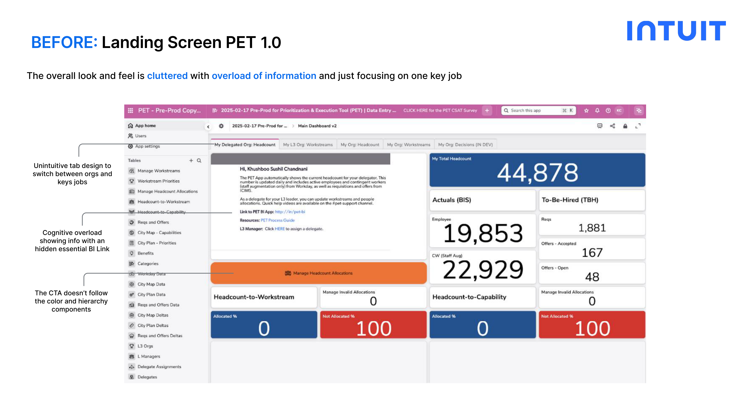
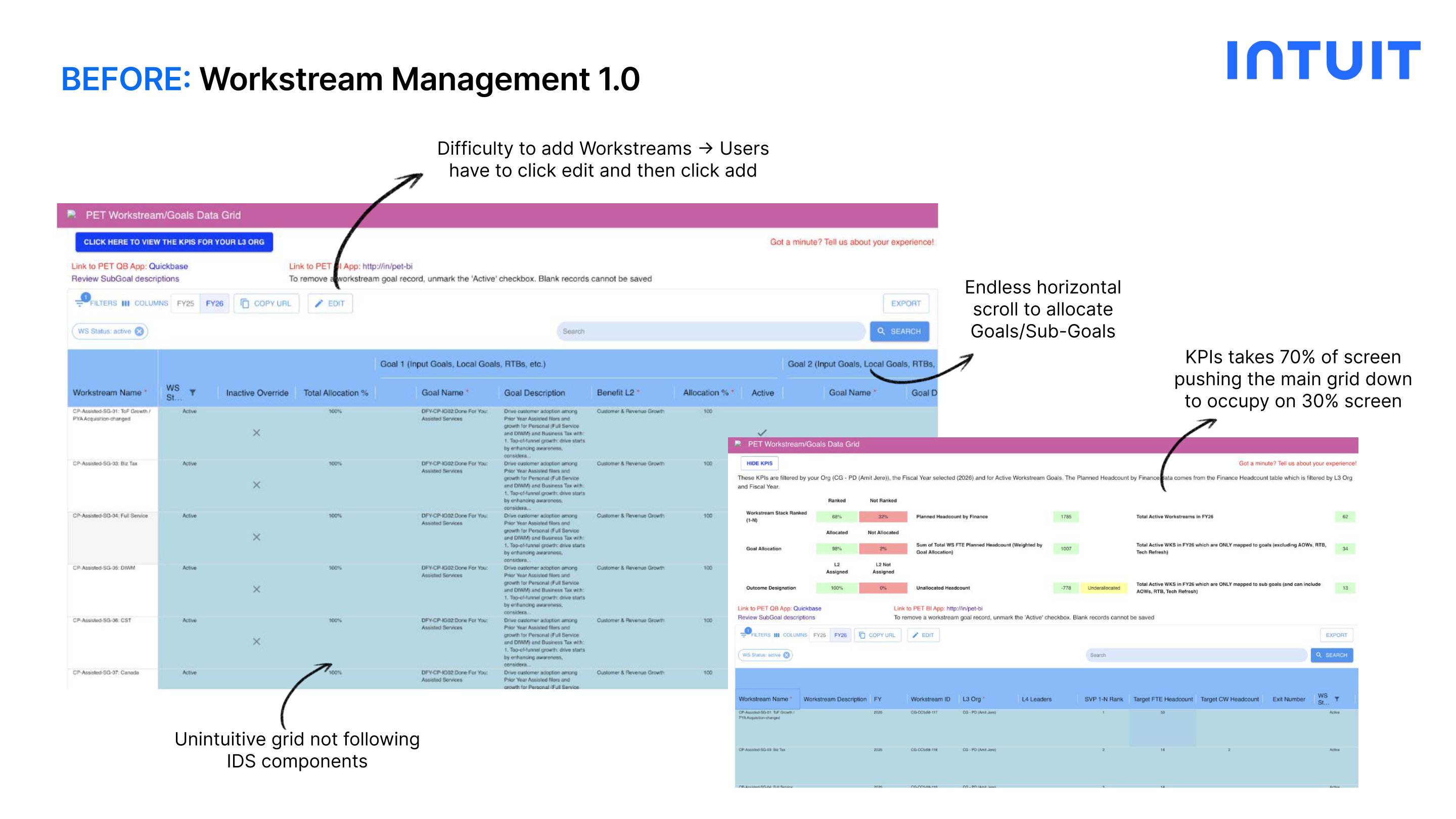
Each persona has different needs, different key jobs, and very different mental models. A one-size-fits-all approach was a core failure of PET 1.0.

Persona 01
Senior Leadership
CTO, SVP
Needs
Strategic insights, real-time investment risk and impact visibility
Key Jobs
View Investment & Big-bet Reports
Persona 02
Delegates
BizOps, TPM
Needs
Ability to allocate resources and create workstreams for the delegated Leader org
Key Jobs
Workstream Management · Workforce Management
Persona 03
Managers
M1 / M2 / M3
Needs
Simple and clear resource allocation workflows
Key Jobs
Workforce Management
Persona 04
Individual Contributors
ICs across teams
Needs
Quick overview of Workstreams to Goals assignment
Key Jobs
View assigned workstreams and work towards goals
Identifying User Pain Points

Users struggled to get their job
done in a simpler & efficient way

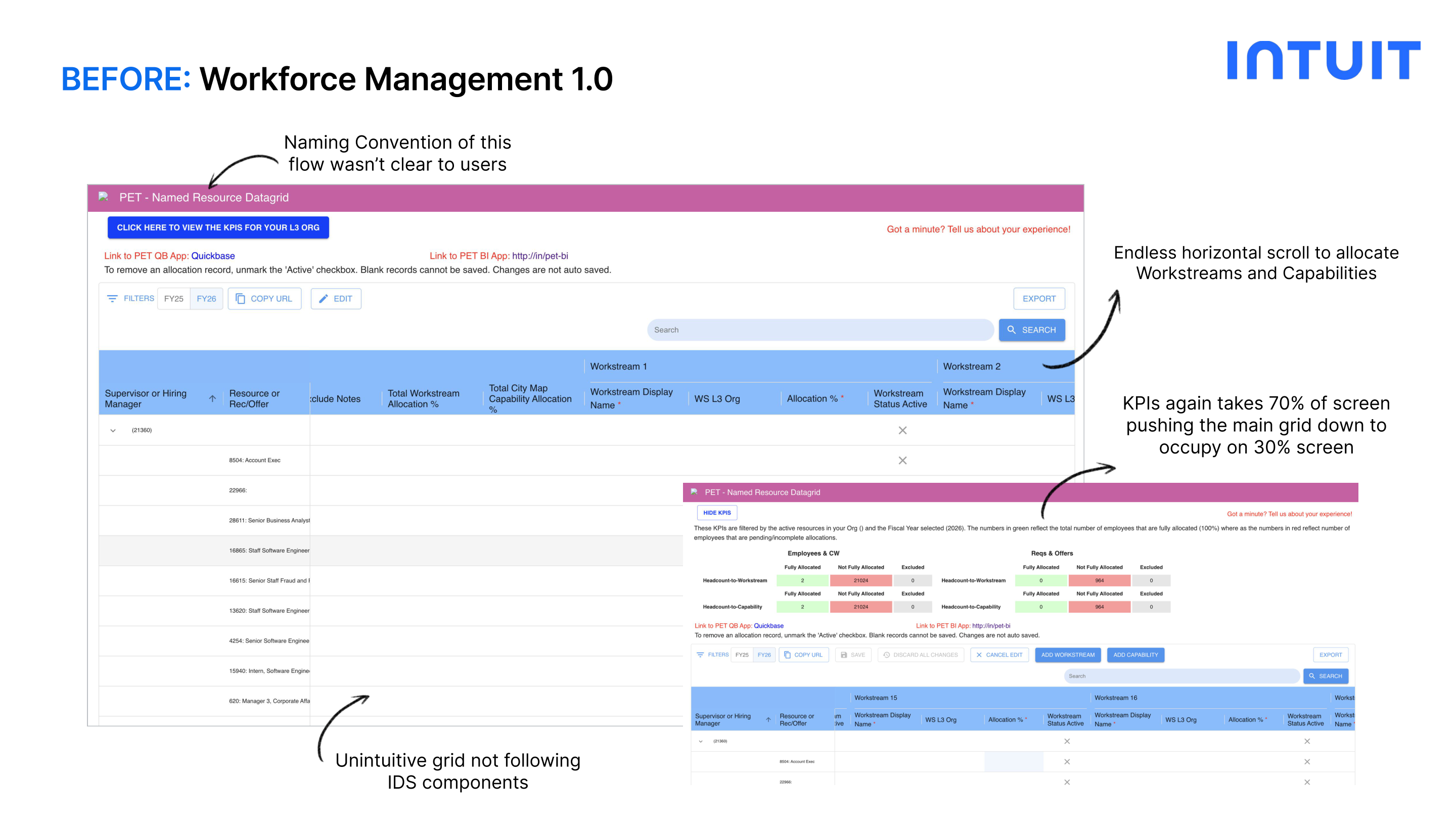
Users across all levels: from Delegates to ICs: reported that PET 1.0's workflows were cumbersome, unintuitive, and difficult to scale.

Complex & Fragmented Workflows
Users constantly jumped between tabs and systems to complete tasks that should live in one place.
Lack of Clear Persona Distinction
The same interface was shown to everyone: Delegates, Managers, and ICs all saw the same cluttered view regardless of their role.
Time-Consuming Allocation Processes
Endless horizontal scrolling and multi-click edit flows made even basic resource allocation a frustrating, error-prone task.
"
I'm constantly jumping between tabs to piece together what this flow is supposed to look like.
Delegate
"
I am just scrolling endlessly with no clear path to allocations.
Manager
"
I need my key action items surfaced immediately and a frictionless way to access the Leader Dashboard.
Delegate + Manager
My Goal

From Fragmented Workflows to a
Cohesive Planning Experience

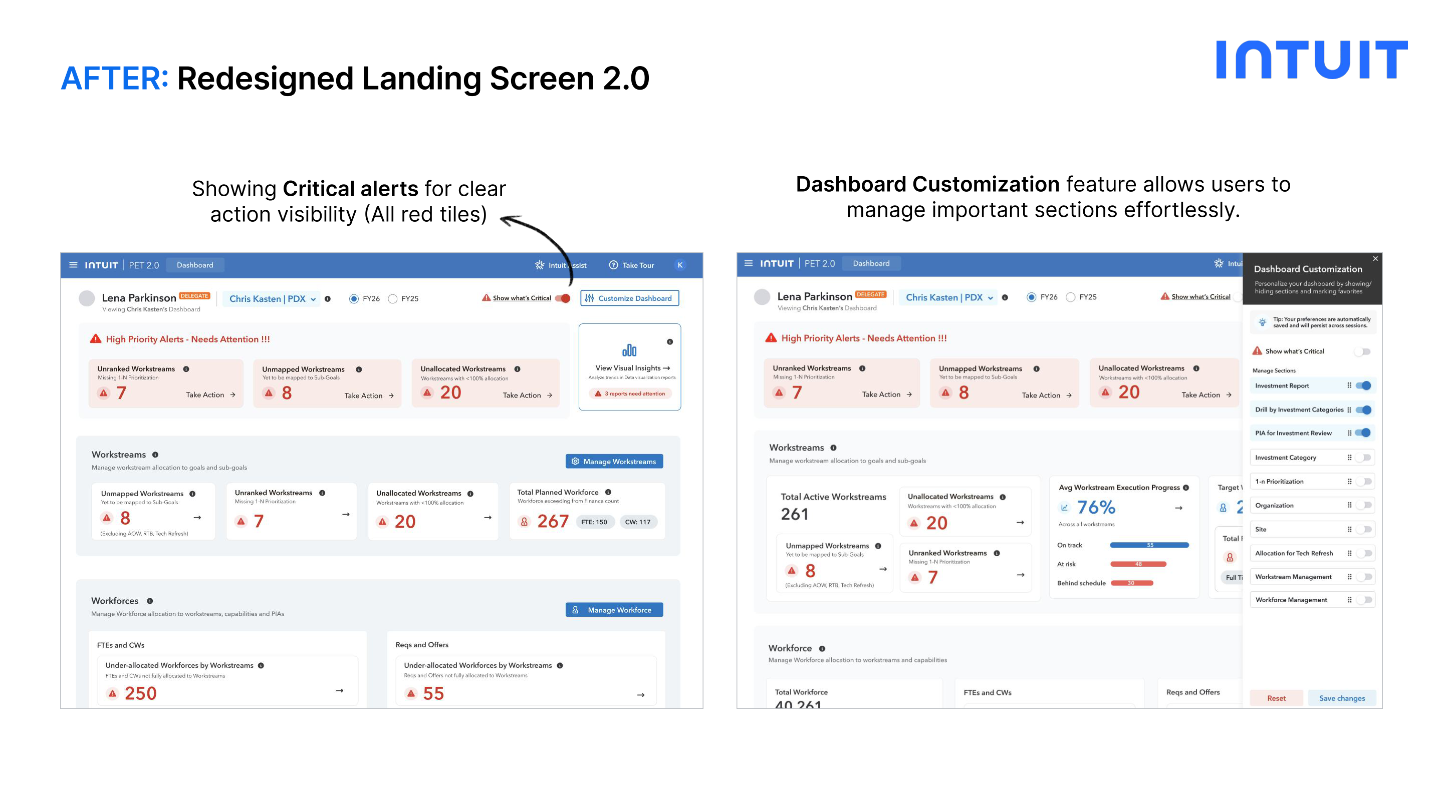
My UX strategy focuses on reducing cognitive load and creating a predictable, aligned system for all personas.

01
Build an Intuitive UI
Clear hierarchy, IDS-compliant components, persona-based views that surface the right information for the right user
02
Scalability & Performance
Design patterns that hold up as the organization grows: enterprise-grade grids, accordions, and dynamic data
03
Automated Workflows
Reduce manual steps by integrating smart defaults, inline allocation, and automated conflict alerts
04
Persona-Based Reporting
Rich, role-specific dashboards delivering the critical insights each persona needs: nothing more, nothing less
Feature 01: Landing Screen

From cluttered chaos to a
persona-driven command center

Before: PET 1.0
Unintuitive tab design to switch between orgs and key jobs
Cognitive overload: too much information shown without hierarchy
Essential BI link hidden behind unclear label ("PET BI")
CTA doesn't follow color hierarchy or IDS components
One-size-fits-all view: no persona distinction
After: PET 2.0
Persona-based login pill (e.g. Delegate) with org switcher dropdown
Critical alerts catching user attention: red tiles for critical, blue for non-critical
Key workstream metrics prominently displayed on the dashboard
Dashboard customization: users select their most-viewed sections as favorites
Renamed 'PET BI' → 'Visual Insights' for clearer labeling; quick-access buttons for Manage Workstream & Workforce
Before: PET 1.0 Landing Screen PET 1.0
After: PET 2.0 Landing Screen PET 2.0
Design Decision: The wireframing phase collapsed multiple separate tabs into a single unified view: allowing each persona to see all their key jobs at once without navigating between sections.
Feature 02: Workstream Management

Replacing horizontal scroll and
hidden actions with an intuitive grid

Before: PET 1.0
Adding workstreams required 2 clicks: Edit → then Add
Endless horizontal scroll to allocate Goals and Sub-Goals
KPIs occupied 70% of screen, pushing the main grid to only 30%
Unintuitive grid not following IDS components
After: PET 2.0
Intuitive accordion/dropdown design to view Goals: no horizontal scroll
Redesigned KPI strip: highlights the most critical info without dominating the screen
Create Workstream button: direct, one-click access to create and map goals
2-step form: Create Workstream → Allocate Goals (multi-select with % allocation + overallocation alert)
Before: PET 1.0 Workstream Management PET 1.0
After: PET 2.0 Workstream Management PET 2.0
Iteration: From User Feedback

KPI Side Drawer

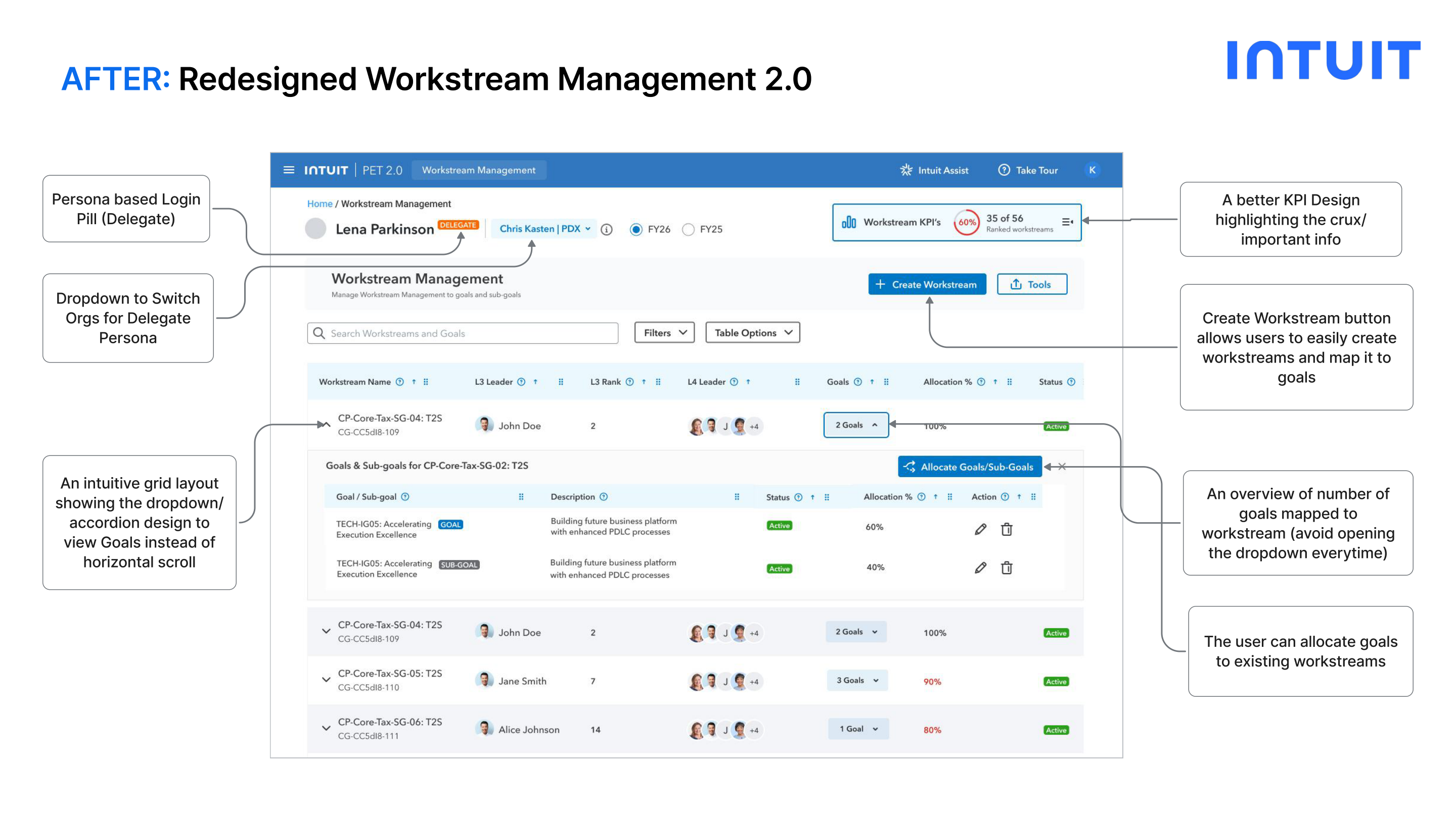
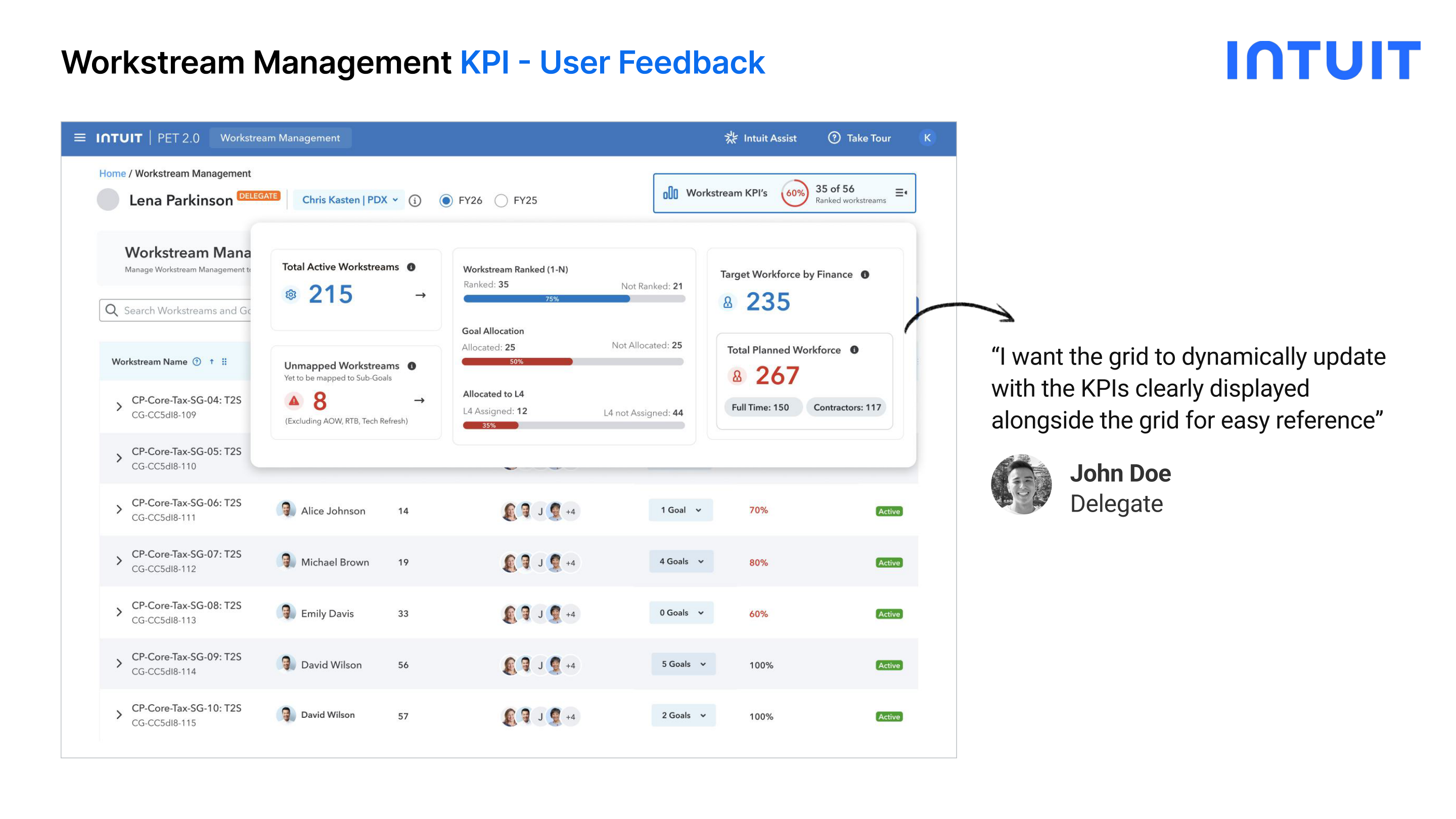
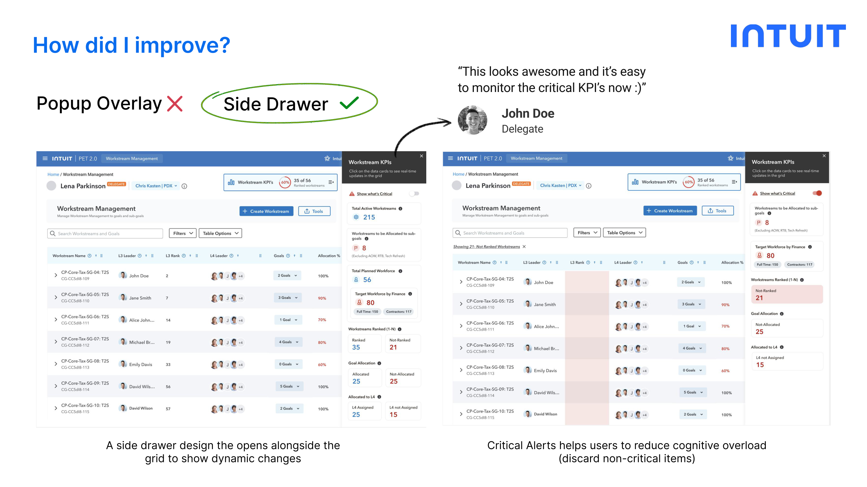
After initial testing, a user needed the KPIs to be visible alongside the grid dynamically. I iterated from a Popup Overlay to a Side Drawer that opens next to the grid.

Popup Overlay: Round 1 KPI Popup Overlay
Side Drawer: After Iteration KPI Side Drawer
Design Decision: Side Drawer opens alongside the grid: users see dynamic KPI changes in real time as they update the workstream data, without losing context of the grid below. Critical alerts also help users discard non-critical items at a glance.
Feature 03: Workforce Management

Rethinking how resources are
allocated to workstreams

Before: PET 1.0
Naming convention of the flow wasn't clear to users
Unintuitive grid not following IDS components
Endless horizontal scroll to allocate Workstreams and Capabilities
KPIs again took 70% of screen, pushing the grid to only 30%
After: PET 2.0
Dropdown to switch between Delegated Orgs and Direct/Indirect reports
Accordion design to view Workstreams/Capabilities: no horizontal scroll
Redesigned KPI strip showing only the most critical metrics
Inline allocation: assign Workstream/Capability to a Resource without traversing the grid
NEW: Delegates can easily allocate to their Leader's Direct Reports (by org) or All Reports
Before: PET 1.0 Workforce Management PET 1.0
After: PET 2.0 Workforce Management PET 2.0
Iteration: From Dev Feedback

Accordion → Supervisor Column

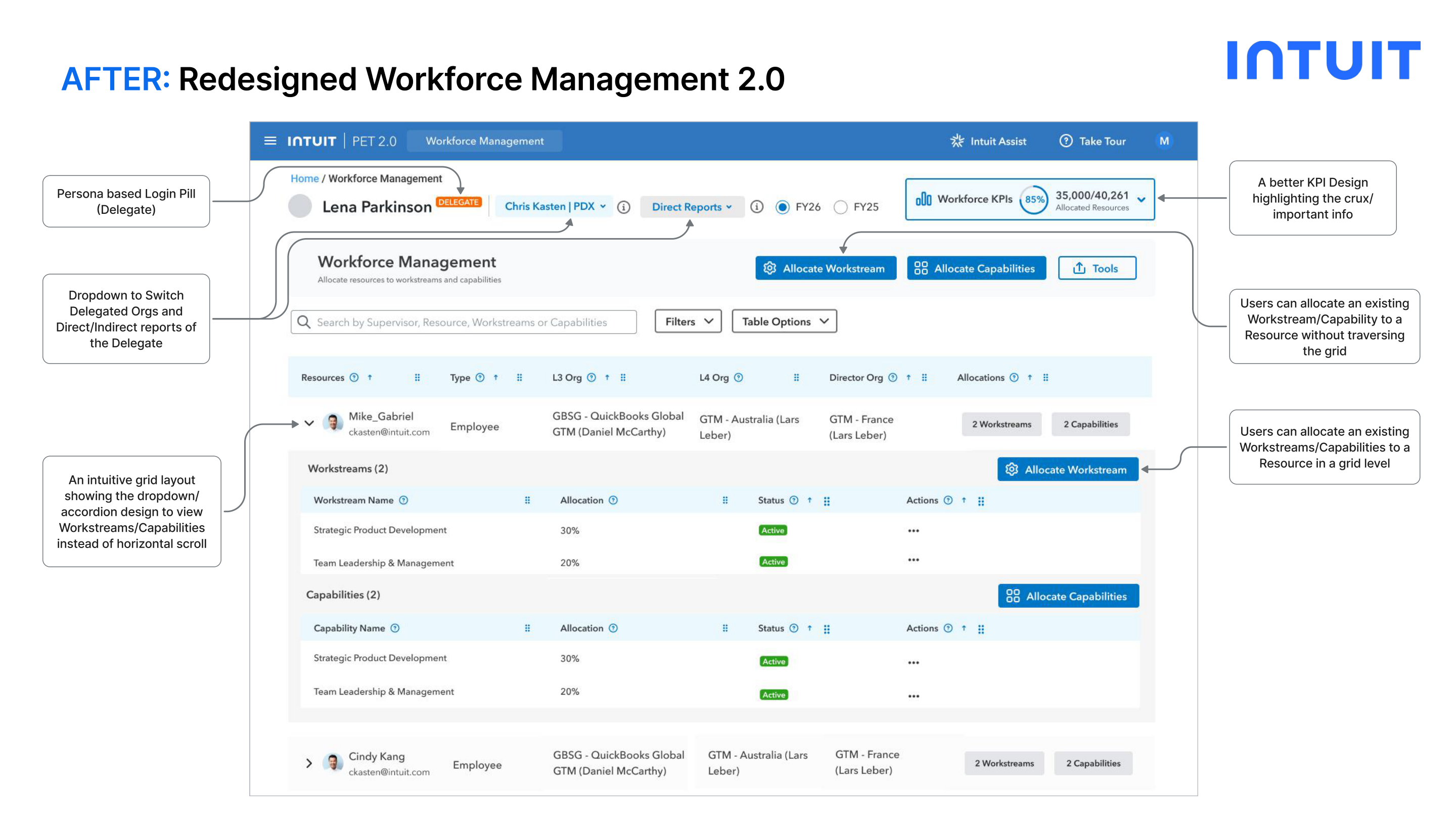
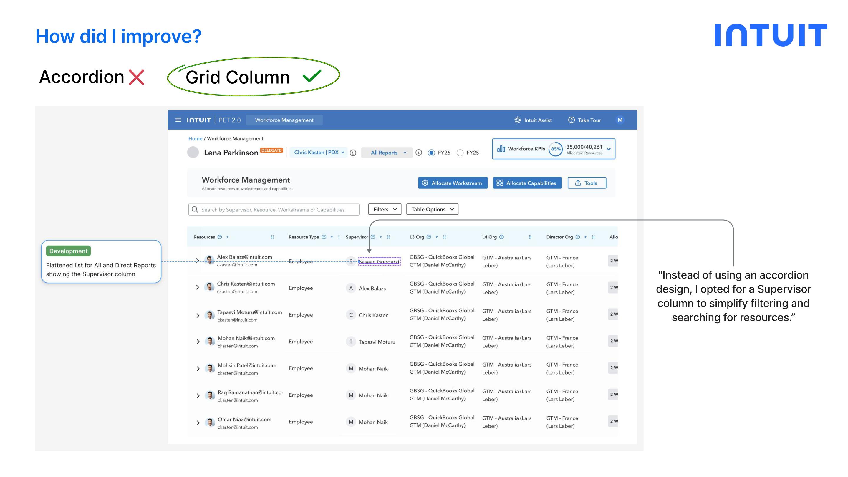
Engineering flagged that the accordion pattern for searching Supervisor/Resources added friction. I pivoted to a Supervisor column to simplify filtering.

Accordion: Before Workforce Accordion Design
Supervisor Column: After Workforce Supervisor Column
Reflection

Challenges & Key Learnings

Challenges

  • Designing for scalability while keeping the experience simple and intuitive for diverse personas
  • Delivering thoughtful, user-centered solutions under fast-paced, high-pressure timelines
  • Helping users adjust smoothly as they transitioned from deeply familiar old workflows to new ones

Key Learnings

  • Persona-driven insights guided clearer, smarter design decisions: one dashboard can't serve everyone
  • Operated as the sole designer: built skills in turning around high-quality iterations fast
  • Quickly refined flows based on User Feedback and PM/Leadership reviews in a tight feedback loop
What's Next

Upcoming Designs

Planned features in the PET 2.0 roadmap, already in early design exploration.

Bulk Allocation
Enable easy assignment of workstreams to multiple resources at once: including GSheet import for power users
Accessibility Improvements
Optimize navigation to accommodate all users, including those who are color-blind or vision-impaired
AI Automation
Integrate AI prompts to simplify resource allocation tasks and boost operational efficiency
Tailored Dashboards
Create dedicated IC, Admin, and Executive dashboards for better visibility and role-specific insights

Interested in working together?

Let's talk about design, internal tools, or your next product challenge.

Get in Touch All Projects LinkedIn